Folly Jazz Posters
Student Work
Throughout the fall of 2019, I worked with the marketing team at the historic Folly Theater in Kansas City. Through theater visits and meetings with their team members, I developed a series of six posters for their upcoming annual jazz concert series. Working with the Folly was an amazing opportunity and a great chance to experience working with a client. This project was part of an ongoing relationship between the theater and the Kansas City Art Institute, in which all junior class students participate and compete.
Final Posters
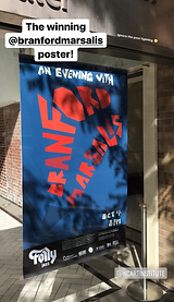
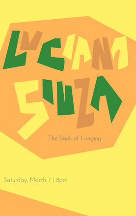
The final series of posters includes a range of color schemes based on the tempo and mood of each artist or group. Each composition features bold, handmade letterforms inspired by the presence I felt the artist Branford Marsalis' music had when conducting auditory research.
I was honored to have been chosen by the Folly Theater as the winning Branford Marsalis poster design. My poster hung outside the folly in downtown Kansas City, and I was recognized on stage before Marsalis' concert.


Process
Theater Visit
Before beginning this project, we met the Folly team and toured the beautiful and historic theater in downtown Kansas City. The intense architecture and rich story of the building delighted and inspired my class. We also got our first taste of receiving a project brief from a client and interacting with them face to face. Their passion for what they do spoke to me as a designer.


Developing the Letterforms
When listening to the music from the jazz series, I was immediately taken by the presence of Marsalis' music. The personality and dominance of the saxophone reminded me of a lion. Inspired by the form of a mane, as well as the outward motion of the projecting sound, I began to articulate this feeling in the early drafts of the Branford Marsalis poster.


Making the Set
The angular letterforms, inspired by my process with the Marsalis poster, paired with bold color pallets for each artist create a cohesive but unique set of posters. Each color pallet was assigned systematically based on the chaos or calmness of the music. The colors and letterforms were adjusted in the next set of posters to increase readability, as these posters would be fixed on an exterior wall.


